Pivot tables are a very useful analytic and visualization tool in Excel to quickly filter, analyze and summarise results from various sources. While they are difficult to master, they are quite powerful and worth the effort to familiarize yourself with their basic concepts.
Source data
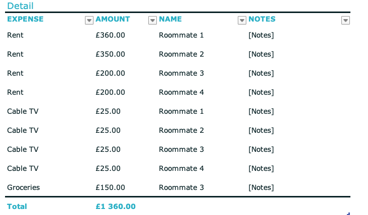
Pivot tables work on various data sources, most frequently referenced from other sheets in the same Excel workbook. It’s generally a good practice to use either named ranges or proper tables to avoid having to update the range every time the source data is changed. In our example, we will use the “Household Organiser” example from Excel templates that contain sample data organized in tables.
Creation of a pivot table
The easiest way to create a pivot table from a sheet of data is to simply click inside a cell in the table then select “Summarise with a pivot table” from the menu and/or the “Insert” ribbon. This way the pivot table’s data source will either be the table selected or simply a range of cells if an area was selected earlier. Please keep in mind, that selecting a range of cells as the data source will make it difficult to keep everything updated when the source data (and most importantly its size) changes.
After clicking on the Pivot Table option, Excel will show a pop-up similar to the one below, where it will confirm the data range and where it should put it. For now, let’s leave it at its defaults, like this.
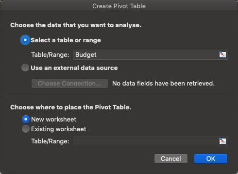
Here you can find the difference between creating a pivot on cell range and a table. Note how the table one has a simple reference in the “select a table range” field as opposed to a direct cell range reference, something like Sheet!A1:B4 . Bottom line – it’s better to use it on tables or named ranges instead of simply a range of cells, if possible.
Setting up fields
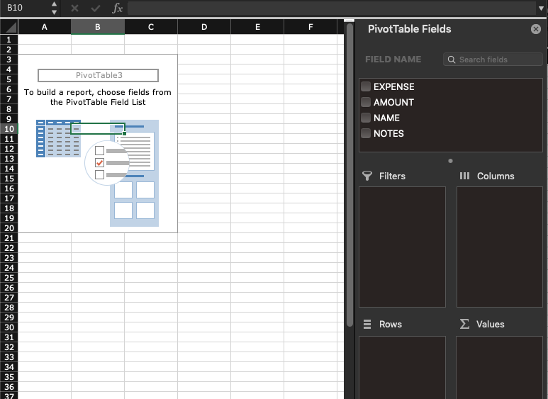
Selecting what information to add to the pivot from the data source should be your next step. Once created, Excel by default shows an empty table with the data source set up but without any fields added so it doesn’t show much (i.e. nothing). On the right-hand side of the screen, it displays a sidebar with the list of fields (taken from the source table columns) and a bunch of empty areas like Filters, Columns, Rows, Summa Values. Each one of these has specific functionality to the pivot table that will be explained below. It is possible to add each field by dragging and dropping them to any of the four areas and the pivot table will change accordingly. To remove a field from any of these, simply drag them out of the sidebar and they will automatically be removed.
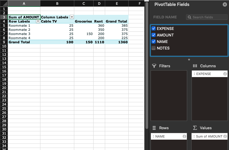
Using our example table above, let’s create a table that lists the amount of money spent by each roommate. Dragging the “NAME” field to the Rows area will add this to the right area of the pivot table (its rows). Once it’s done, the pivot table automatically updates by showing all the roommates’ names. For now, it doesn’t show anything else because none of the other fields were added to it yet. Next, let’s add the “AMOUNT” field to the Summa Values field. After this, the pivot table should start making sense, showing a breakdown of costs for each Roommate. Let’s add the “EXPENSE” field to the Columns area, this adds the Expense field as columns to the pivot, providing a breakdown of costs per roommate and expense type. The table should look like this below:
Multiple fields in one area
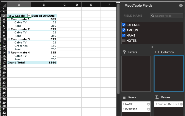
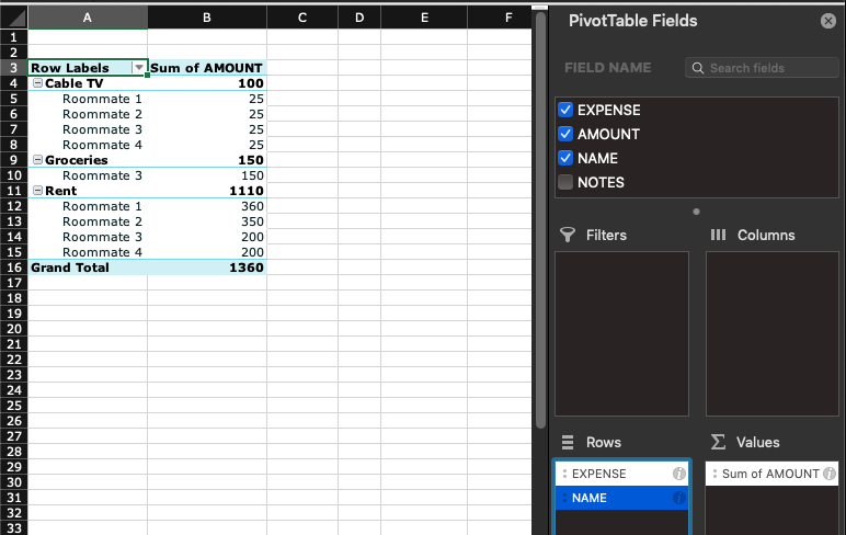
It’s also possible to add a second field to the same area (i.e. rows or columns) – this makes Excel group information by the first and the second column (or more, if needed). Here we moved the EXPENSE column from Columns to Rows, note how columns disappeared but the list of expenses shows up under each name, which is the first field in the “Rows” area. The order of fields matter, depending on whether the Expense or the Name field is first, the pivot table displays data differently, i.e. summarizing data using the first column then breaking down by the second. It’s possible to sort fields by simply dragging them in the sidebar (Rows area)
Data filtering
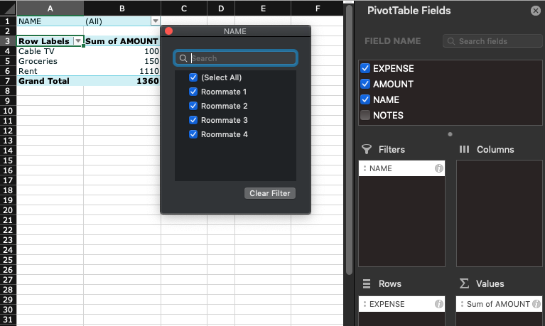
Until now, we have worked with the whole data set from the source data but filtering them to use only parts of it is a useful feature. This can be accomplished by simply dragging a field to the Filters area. This adds a dropdown filter, similar to the ones used in table headers to sort / filter information. Let’s drag the “NAME” field from Rows to Filter, this way we can get a breakdown of costs for a specific EXPENSE type. Moving it there creates a filter above the pivot table where any of the names can be selected by clicking on the little arrow next to the filter above the pivot table.
Group functions
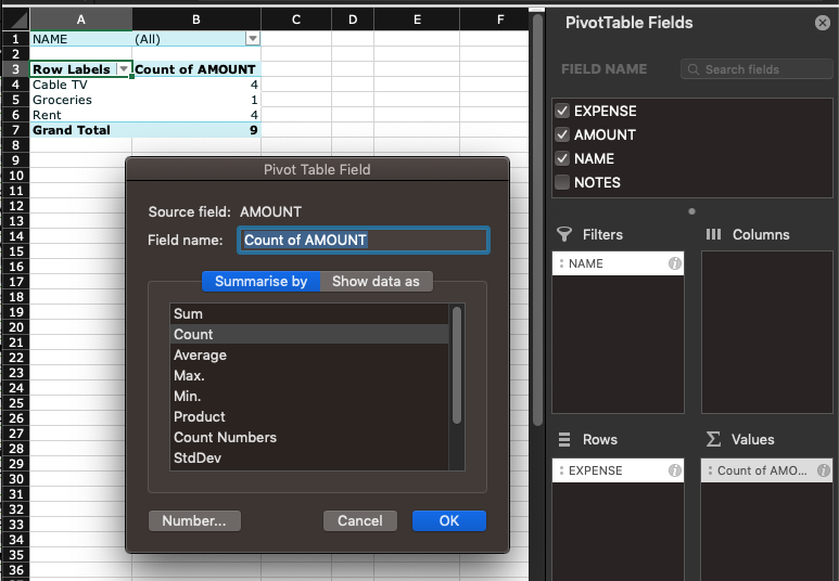
By default, Excel summarizes fields added to the “Summa values” area by adding them in the pivot table. While this is the most frequent use case, it’s also possible to use different ways to summarize data, i.e. counting them or calculating the average or the minimum for each row/column. This can be changed by simply clicking the (i) icon next to the field or right clicking on it and selecting “field settings”. Here, the “summarize by” tab lists all the possible grouping functions. Sum adds all field values (this is the default that we have used until now), the rest of them have pretty self-explanatory names. Let’s select COUNT for now for our field and click OK. This should change our pivot to display the number of records for each Expense type as opposed to the sum of the expense amount.
There is a lot more functionality of pivot tables but this should cover the simplest and most typical use cases. Since it instantly updates when options are changed, dragging fields around and changing options is a great way to experiment and get to know how it behaves.