Excel Power Query is a powerful tool that allows you to import, change, and analyze data from various external information sources. Let’s find a live data feed and build tables to display stock market information directly in an Excel sheet.
Power Query is now a built-in feature in all recent Excel versions (2016 or Office 365). Unfortunately, authoring (editing of queries) is not yet available in Mac Excel so these examples are Windows only. It’s possible to open and refresh data on a Mac, it’s just not possible to change them yet.
Free live data feed from Alpha Vantage
Alpha Vantage (https://www.alphavantage.co) provides a free data feed of various stock market metrics in CSV and JSON format that we can directly import into Power Query. You can read more about JSON in Excel here: Using external data with Excel
You’ll need to register for a free API key to access their services – there is demo access to test basic functionality but custom API calls won’t work with the demo key published on their website. API documentation is available at the following URL: https://www.alphavantage.co/documentation/
Basic data query
To get market information on a specific stock, we can use the following endpoint: https://www.alphavantage.co/query?function=TIME_SERIES_MONTHLY&symbol=IBM&apikey=demo
This returns a demo feed of monthly prices of the stock IBM. Note how the API key at the end of the url is “demo” – this needs to be replaced to your own if you change anything in the URL.
Power Query is accessible in Excel under the Data ribbon, let’s select Get Data / From Other Sources / From Web. A popup window will open, asking for the URL – paste the URL above and click OK. It should then open the Power Query editor, loading data from the feed over the internet automatically.
The data feed contains two different parts, the Meta Data (information about the feed) and the Monthly Time Series. We’re currently interested in that, so let’s click on it to open.
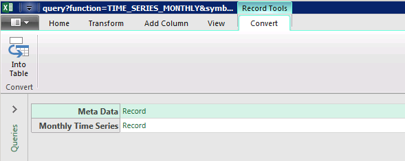
After clicking the “Record” link next to the Monthly Time Series, it shows the list of records in that part of the data feed, listing one row for each date.
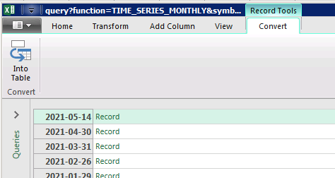
Clicking Into Table (top left) loads this data into the editor where we can transform it to finally insert it into an Excel sheet.
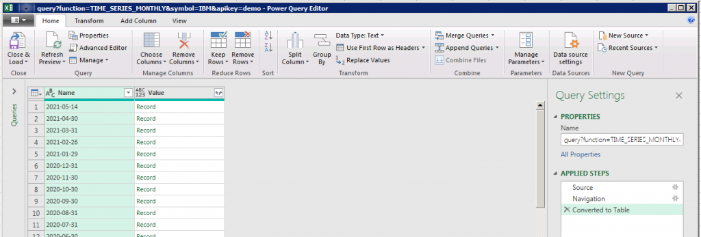
Let’s look at this Power Query window and examine what each part of it does. The top row lists all the possible functionality in a ribbon, just like normal Excel does. The most important button is “Close & Load” (top left), clicking this will close Power Query and finalize importing data into Excel. We’ll do this once we’re done with the transformation.
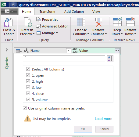
Below that, there is this area that shows a preview of the current query we’re working on. Each column header has a small error where they can be filtered for or in case or Records, a small double arrow that fetches all records fields into the table. Let’s click that double arrow next to “Value” in the second column, to fetch all values from records and put them into the table. A small pop-up window will show, showing a list of columns to insert. We’ll use all of them for now, so simply click OK to continue.
Once this is done, all the numbers from those records show up so data is starting to make sense. On the right-side there is a list of steps that were applied to the data.
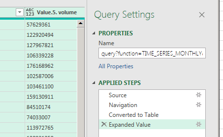
In the example above we had four steps yet,
- source (set the data source)
- navigation (select which part of the data feed to show)
- converted to table (convert the that we picked into table format)
- expanded value (expand that record column to its values)
Each step can be changed by clicking the little cogwheel next to them or they can be removed by simply clicking the X icon to the left.
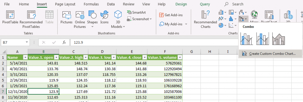
To effectively use this data in Excel, we should change the data type of each column so it properly matches the data it contains. To do this, select Transform from the ribbon then select the first column (dates) by clicking on the column header.
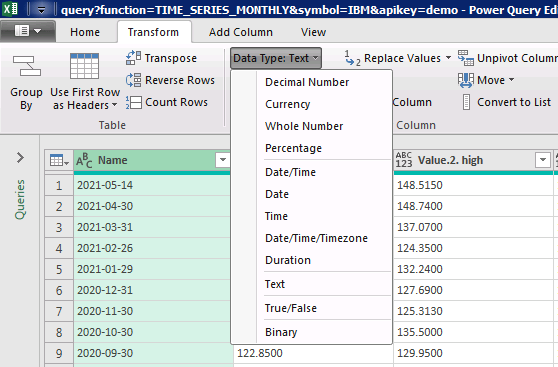
Let’s set the data type to Date – Excel will instantly change the data and show it as a proper Date field according to your regional setting. The same process should be repeated for the rest of the fields to change them to Decimal Number. Multiple columns can be selected by using the Shift key – click on the first column (titled Value.1.open) then press Shift and click on the last one (Value.5.volume) to select all 5 of them. Now you can select Data Type: Decimal Number from the ribbon to make them proper numbers.
Finally click “Close & Reload” on the Home Ribbon to load the whole table and inject it into the current Excel workbook.
Visualizing data with an Excel Chart
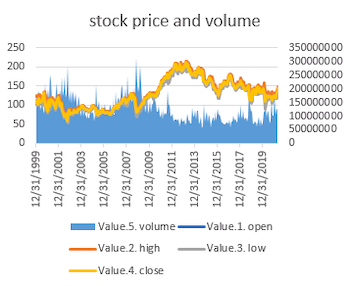
Now that we have all this information in Excel, let’s visualize it using a chart. Our table contains three different types of information:
- date column – this will be our horizontal axis
- stock values – similar ranges
- market volume – completely different range
Showing these on a combined chart will only work if stock values and market volume can be shown using a different axis otherwise stock values (130-150) will show up as a flatline around 0 because the market volume is in the billions range.
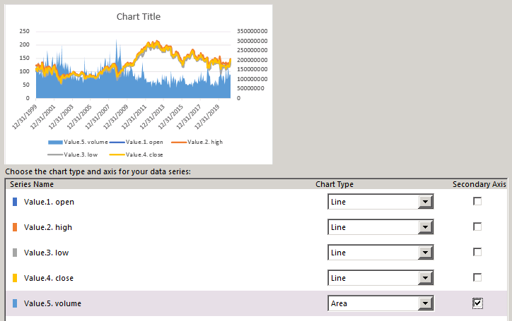
Luckily Excel provides a way to display such information, it’s called a “combo chart”. Let’s select (any) cell inside the new table and select “Combo chart” / Custom Combo Chart from the Insert ribbon.
Doing this will open a popup where we can select how each column should be represented. Let’s select the first four values to be “Line” types and the fifth (volume) to be an “Area” and to be shown on the Secondary Axis. This will avoid messing up the ranges. If all goes well, it should look like this:
Next, we’ll look at how to use parameters to fetch data for different stocks, create dropdown and autocomplete fields based on API calls to find stocks and more so check back for more updates.